As an owner of a company that buys a lot of machined parts I often receive solicitations in the form of brochures. I appreciate the time fellow business people take in putting together marketing materials to pursue sales, but correctly pursuing a customer starts well before the stamp hits the envelope. I received a brochure lately that reminded me of the basic principles of good visual communication: grammar, spelling, content, layout and second opinions.
How Not to do a Brochure
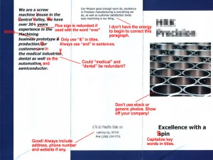
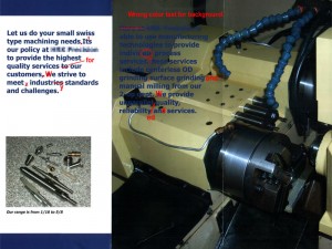
The brochure I’ve used to illustrate these basics of visual communication is from a real company that is actually using this brochure to attract customers. What they may not realize is that they may be causing customers to avoid them like the plague. I’ve graciously hidden their name. Though not everything they did was wrong, our English teacher here would have definitely issued an F-. My favorite quote, “excellence in Precision manufacturing is everything we do”, might actually be true… because we sure know that basic writing isn’t.
Grammar and Spelling
Most of us in manufacturing were not top students in English, but that does not excuse us from knowing the basics of punctuation, sentence structure and capitalization that are needed to correctly communicate. The aim of this section is not to teach these basics, but to emphasize their importance. Even if we don’t have the skills, or don’t want to learn them, we at least have some people in our lives that can help. Even in the worst case scenario we could make a call to the local high school to ask the English teacher to refer an AP English student. $25-$50 to proofread or help rewrite copy would have that student thrilled.
Content
The most important aspect to a good brochure is the content. There are two sides to content – visual (photos and graphics) and copy (text). Let’s cover the copy with two lists – Basic Copy and Optional Copy:
Basic Copy
- Company Name
- Phone number
- Address
- Website address (if any)
- Types of manufacturing processes offered
- Types of materials worked with
- Certifications and/or quality standards
- Markets served
Optional Copy
- Machinery list
- Customer list
- Size of company
- Brief company history
- Simple map showing the company location
- Contacts of key company individuals or departments
Layout
Creating a good brochure layout is definitely a stretch for most shop owners. Our definition of what looks good is usually defined as what type of finish it has. Needless to say we may not even possess the talent and tools to even know where to begin to create any marketing material. It looks like the creator of our example brochure used a company that I too have used for quite some time – VistaPrint.
VistaPrint is an online digital printing company that offers a wide range of products at excellent prices. Whether you’re a professional graphic designer or a first time user, VistaPrint has all the tools needed to create and produce everything from shirts and mugs to business cards and brochures. They have an extensive set of templates ready to customize with logos, photos and copy. When choosing a layout be sure you are able to include the copy elements listed above as well as the following visual content:
- Company logo
- Current photos of your facility
- Text in a size and color that is legible
- Photos of sample parts
- Photos of key individuals or company products
Our example brochure has what is called “stock photography” on the front. This is a no-no. Don’t waste precious photo space with something that isn’t authentically from your company. Make sure all photos are well lit and in focus. Always uploading the highest resolution available or else you’ll run the risk of your photos looking pixelated.
Second Opinions
One of the more satisfying events I ever experienced was when an arrogant, know-it-all boss only trusted himself and his brown-nosing secretary to proofread his work. It all came crashing down when a print order of nearly $6,000 was tossed in the dumpster due to a simple (and obvious) key word that was misspelled. The rule-of-thumb is always get as many eyes on your work before production… pass around the rough draft at lunch and listen for feedback. Good inspection is a key factor to a shop’s ongoing success so why should it be any different with marketing. Plus, what does a poorly written brochure say about your company’s quality control?
By following these key principles of grammar, spelling, content, layout and second opinions you and your team will be equipped to create a brochure worth holding on to and not adding to the round file.
- Jay Pierson


I have been on the precision machining business for many years all our work
came by references but in today’s market we have to do something else we have very intelligent people working with us but nmo one including myself can write a text I think your coment was very useful and after reading it I realized that I have to seek proffesional help to write this brochures.
wwe are now trying to diversify and get other types of machine work we are very well equiped but if we do not have a well done marketing tool we are at odds
thank you for the article and since you have requirements for machined parts take a look at our web site if you have the time of course.
g.prebelli@prebelli.com
pfffff
Great post. Extremely helpful information. Thank you and good luck.